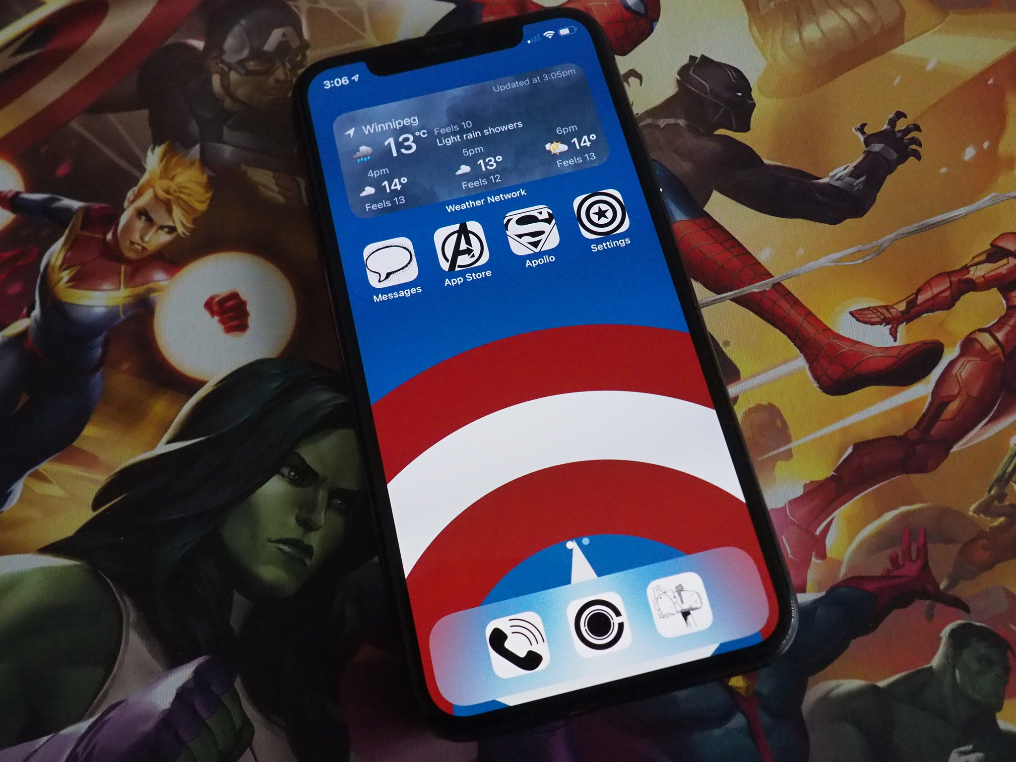
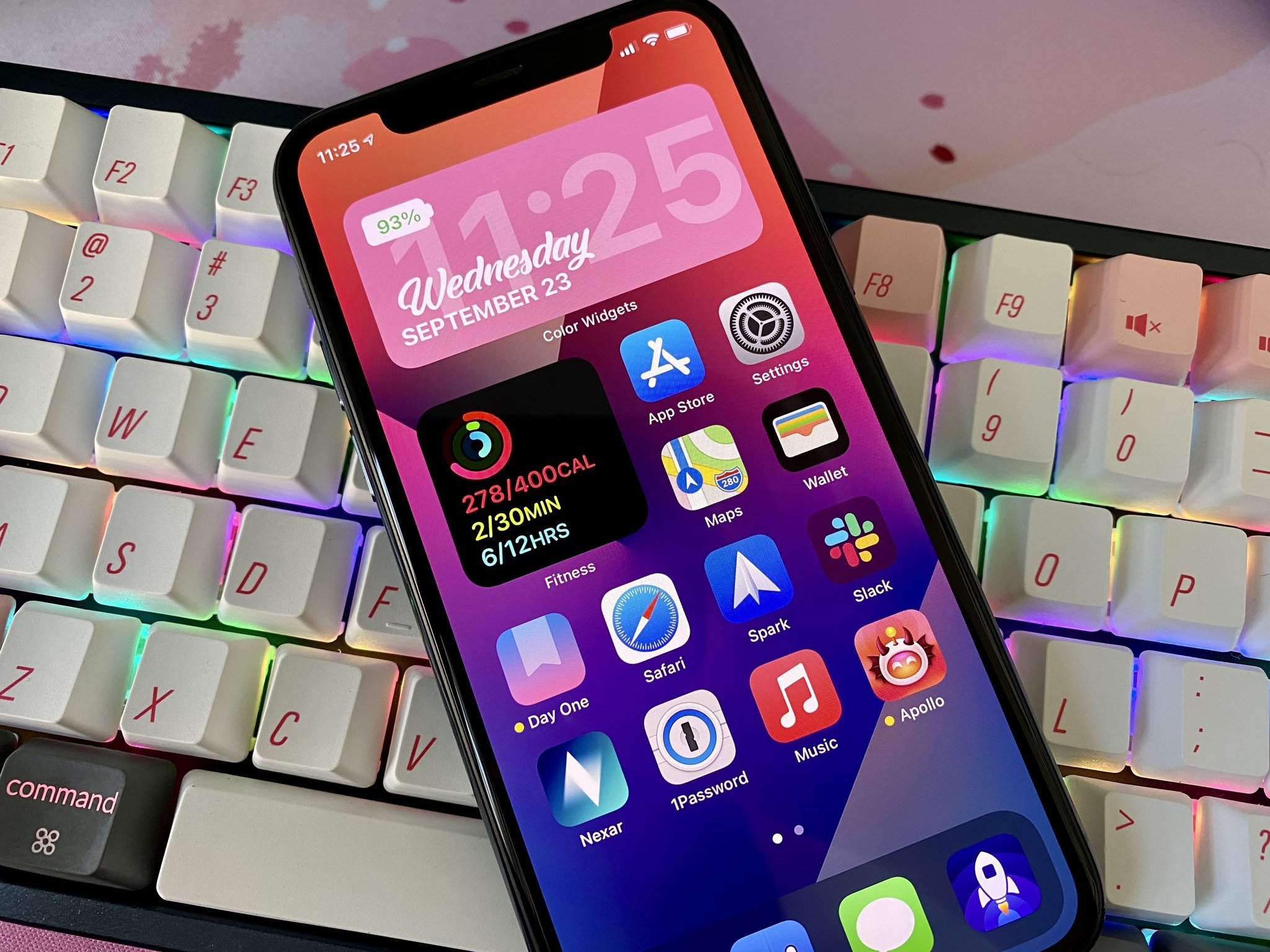
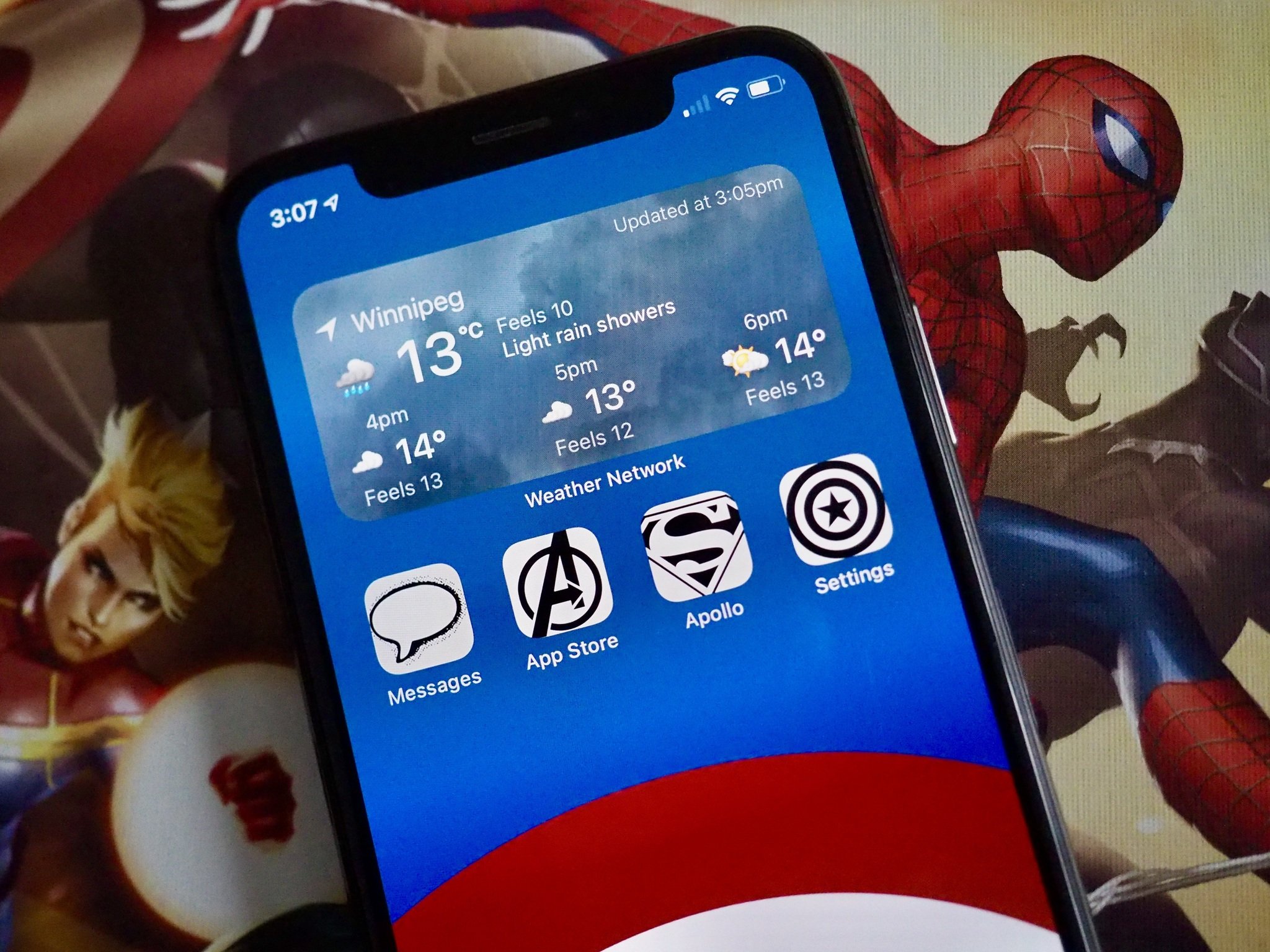
Thanks to iOS 14, you can now customize your Home screen as you see fit.
Apple released iOS 14 to the masses just a little over a week ago, which is full of many great new features, but it has unleashed a whole new beast with iOS 14 Home screen customization. Even the average person, who is not always in tune with the tech world, has a growing interest in updating their iPhone to iOS 14 because they want to make it "aesthetic AF."
In fact, Pinterest broke its daily download record because people want inspiration for iOS 14 Home screen aesthetics, and others are getting rich quick by making and selling icon sets for iOS 14. And this has all happened in just one week (as of this writing).
Thanks to iOS 14, Apple certainly has given users much more freedom in terms of customizing their devices, much like how Android has been doing for years. However, the current implementation also highlights the limitations, making the entire experience a tarnished one that I honestly don't really care for.
iOS 14 reinvents the Home Screen
Back when Apple showed off iOS 14 at WWDC 2020, I was ecstatic for the Home screen changes. For years, I kept pretty much the same Home screen, with maybe a few changes on what apps showed up on my first page from time to time. But I was excited to finally be able to have widgets on the Home screen, like Android has had for years, while also eliminating a handful of pages with random apps thanks to the App Library.
Now that iOS 14 is out, I've changed up my iPhone workflow drastically by getting rid of a few apps, hiding all app pages beyond the first page and using just the App Library, and putting a few widgets on my Home screen. My page one has a medium Smart Stack, the small Fitness widget, and my most-used apps. On the second page, I simply have a large Apollo widget for my Home feed and a medium Siri App Suggestion widget.
I made these changes because, for me, it just works. I wanted widgets because it gives me information at a glance, and honestly, it spices up the Home screen enough for me. And if I want to get to an app, it's just a tap away, and boom — I'm in the app.
The new trend of iOS 14 Home screen aesthetics is something I never expected to see, truth be told. I just don't have the time to think about what "a e s t h e t i c" I want my iPhone to have, aside from the wallpaper. Once I have settled on a theme, I need to go download some widget making apps and tinker around with them to get the right information, color, font, and maybe a background image while I'm at it. Oh, and don't forget some inspirational quotes and other things, which may end up just cluttering your phone — the sky's the limit here. And make sure you have the right set of custom app icons to go with your personalized widgets.
While I have seen some cool iOS 14 Home screen "lewks," I have also seen some...uh, rather unpleasant ones (to me, anyway, as this is all subjective) as well. Honestly, this whole fad of customizing themes is just not for me — I like Apple for the simplicity, and if I wanted to customize to this extent, I would have just used an Android phone. But hey, whatever floats your boat — if you enjoy the customization options in its current state, by all means, go for it! But it also shows the crippling limitations that Apple needs to improve on.
The limitations of customizing an iOS 14 Home screen
Really, it's great to see more customization options for iOS users. It further closes the gap between iOS and Android, and that's always a good thing. But there are also some significant crutches to how iOS deals with customization.
First of all, widgets — they merely display information for quick glances, but there is no interaction with them. Why? The widgets from previous iOS versions, where you could only have them in the "Today View," allowed for some interaction. Right now, widgets offer no interaction, so if you need to do more than just look at them, it just launches the app. Yeah, sure, this static element works great for those "kewl aesthetic lewks," but if you wanted widgets to have a practical purpose, they fall short.
And the one that annoys me the most is how one is supposed to get custom app icons. You need to use scripting in the Shortcuts app for every single individual app that you want to change the icon for. Yes — Every. Single. App.
I really don't have time for all that, you guys. But make sure you have that perfect set of icons first. And since these icons are done through Shortcuts, that means two things: you can no longer have the notification badge icon on them, and Shortcuts has to open up before you get to your selected app. It may only be a few seconds, but it definitely slows down the workflow since it's an extra step. An extra step just for the "lewk."
Yes, those custom iOS 14 Home screens can really look awesome, but Apple's limitations on widgets and custom app icons taint the experience. Personally, I just don't find customization worth the hassle right now.
A step in the right direction for custom Apple Watch faces?
Even though it's not for me, it's great to see what people can come up with. Some of the themes I've seen are cool, and I do love good icon sets — I just don't have the patience for it myself. Plus, with this boom of customized Home screens, perhaps Apple can see that customization is something many folks want, and make improvements on in the future. Like really, is it so much to ask for a way to upload a custom icon into the settings or something?
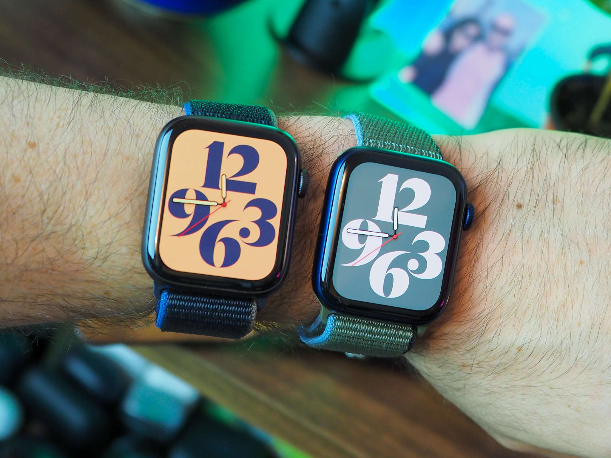
One thing that I hope comes sooner rather than later is the ability to customize Apple Watch faces. I would much rather have the ability to customize my Apple Watch rather than my iPhone Home screen, and I've seen some cool faces that people have created to resemble things like Star Trek communicators, and just display things like programming code. It took 14 iterations of iOS for customizable Home screens without jailbreaking, so maybe custom watch faces are a few years off — shrug.
Do you care about your iOS 14 Home screen aesthetic?
What do you think about the "aesthetic AF" iOS 14 Home screen trend? Did you customize your Home screen to look super cool? Share them in the comments!
from iMore - The #1 iPhone, iPad, and iPod touch blog https://ift.tt/3cuzbyL
via IFTTT


No comments:
Post a Comment