What you need to know
- An Reddit user created a side-by-side comparison of every iPhone camera.
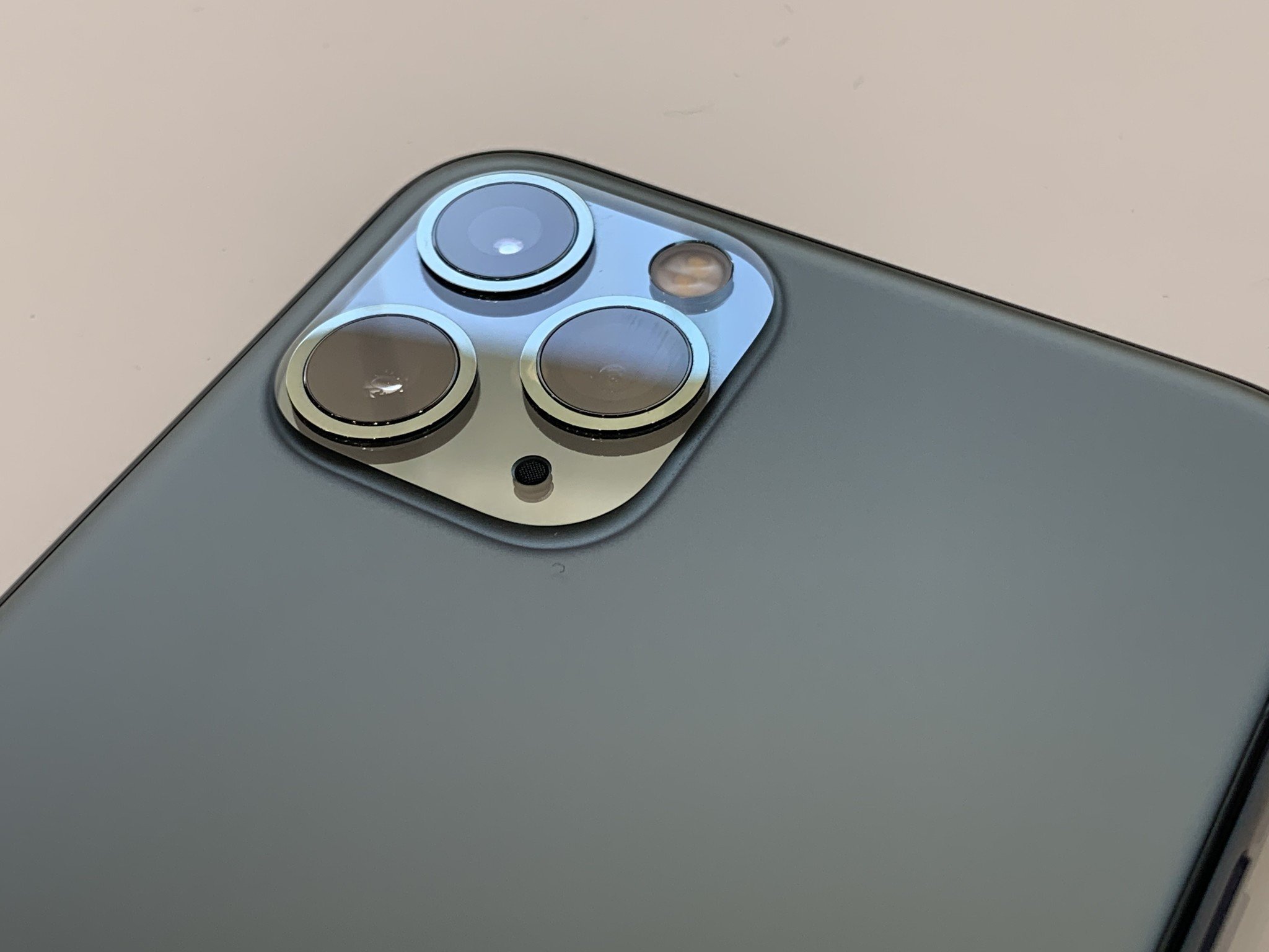
- The idea came from the iPhone 11 Pro's polarizing camera design.
- The iPhone camera has truly come a long way from its 2007 origins.
It has been a long journey to weirdness.
The iPhone camera has gradually transformed over the years from the single lens set-up to busier designs that have more going on. None have been more dramatic than the camera that comes with the iPhone 11 Pro. This got an intrepid Apple fan curious about the transformation and led him to create a side-by-side comparison of every iPhone camera.
Up until 2016, the camera was basically the single lens with a slightly tweaked design to include the hump that was first introduced in the iPhone 6. But by the iPhone 7 Plus, Apple introduced the dual-camera set-up that began the radical change in the way the iPhone camera looked.
By the iPhone X, the dual camera moved to the vertical placement and eventually Apple went with the polarizing square finish on the iPhone 11 Pro. Redditor benjaninga's comparison really puts the transformation context.
Many people commented on how they preferred the flush camera design and wished Apple would go back to it. There's no denying having a phone that doesn't bobble when you place it down on a flat surface is sorely missed.
It's almost hard to believe that at one point, the camera was one of the most minimalist aspects of the iPhone. Now it has turned into a symbol for which model you have. Once you see the triple-camera system, you'll instantly know people have the new iPhone.
Take a look at the comparison and let us know which was your favorite iPhone camera design.
iPhone 11 Pro hands on: Apple improves its flagship smartphone
from iMore - The #1 iPhone, iPad, and iPod touch blog https://ift.tt/2N9EQ3y
via IFTTT


No comments:
Post a Comment